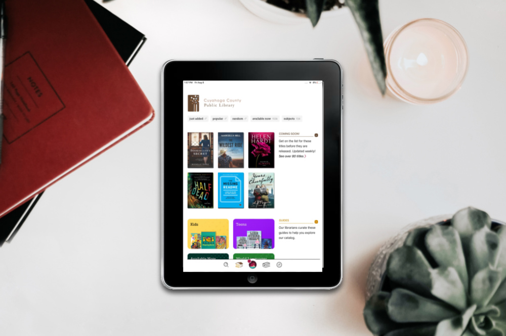
Refined navigation bar, new settings menu, search enhancements and more in the latest Libby update!
Last month, we previewed upcoming changes to Libby, and we’re delighted to share that they’re now live. Here’s a summary of what’s new—please take a few minutes to review and share with your staff. We also encourage you to watch this tutorial for a brief tour of these updates.
Refined navigation bar: We have updated each icon in the navigation bar for clarity and consistency. There is also an option in the new Settings menu (more below) to add labels to the icons, if desired.
Library home organization: We’ve simplified and refreshed the home view for design consistency. Extras and Guides are now featured prominently, while Preferences have been moved to search results, lists, and guides. Later this year, we will offer options in OverDrive Marketplace to further customize the library home view—stay tuned!
Search enhancements: When searching for a book, users will see a new “Explore with Filters” section, with options to easily browse by format, availability, skip-the-line titles, and more. Advanced search filters are available with the + more button on this screen.
New Settings menu: Many existing settings (e.g., manage notifications, change download rules, choose your language, etc.) and some new options, like adding labels to the footer icons, are available in a centralized location in the in-app menu.
Timeline improvements: The timeline has a new layout, with each title displayed once in a single collapsible entry. More title and user activity details are available in this new layout.
These updates also support our ongoing efforts to build a delightful experience for users with diverse accessibility needs.
Please contact your Account Manager with any questions.
Tags In
Browse blog and media articles
Public Library Training
K-12 Library Training